Erasures and Palimpsests

I have recently adopted a new daily practice that involves both mark-making and erasing to create a drawing. It is a two-step process: First, I make a quick automatic drawing or blind contour sketch in pencil (or more recently charcoal or crayon). Then I begin removing lines with an eraser. As with the drawing, there is no conscious aim but rather a sort of improvisation. I work intuitively, breaking up long lines, excavating curves and points of intersection, adding areas by removing boundaries. When I am done, I have a loose conglomeration of shapes that are new to me, that I wouldn't have consciously drawn, and which do not resemble known objects. The erased lines that tangled and obscured the shapes are still partly visible as shadows and depressions.

All of which got me to thinking about the use of erasure as a means of creating art. Most notorious, of course, is Rauschenberg’s “Erased de Kooning Drawing,” with its own mythology that has grown up around it – the initial request by Rauschenberg is always accompanied a bottle of Jack Daniels, the 40 erasers he used, the month of toil. It’s Freudian, it’s biblical, it’s iconoclastic; much of it is also, I’d wager, apocryphal.

This is far from the only artist or medium employing erasure as a way of creating. Photography of course has a long history of erasure – by cropping, by dodging, by burning, and more recently by Photoshopping – that has not only artistic ends but also political and destructive ends. I am interested in the creative side of erasure, though, what Terry Winters called in a 2010 lecture “subtraction as a construction device.” Traditional sculptors, for example, use a subtractive process. Think of Michelangelo's unfinished pieces that show bodies emerging as the marble is ‘erased’. Printmaking, ceramics, collage all use removal as a means of creating.

There is another, more contemporary type of art that employs removal and erasure, usually in public spaces and within architecture, what might be called street art, though that is a poor fit in this case (one writer has termed it Intermural Art). Gordon Matta-Clark, with his Conical Intersect and Office Baroque, would be a forebear. More recently, there is Brad Downey and his excavations, such as What Lies Beneath and Searching for Something Concrete. There is a certain genealogy for Downey that one could trace that would include, in addition to Matta-Clark, artists such as Christo and Jean Claude, certain Minimalists, Joseph Beuys, Johns and Rauschenberg, straight back to the primogenitor, Duchamp. One family trait would be the puckishness that each exhibits; another, the use of what Jasper Johns called the “additive subtractive,” removing, erasing, or obscuring in order to make something new.

Ellen Fullman: Sculpture and Music

I’ve been listening to Ellen Fullman’s work since I read a NYT profile about her last year, after she was named a Guggenheim fellow. Her creation, the Long String Instrument, is both installation and working musical instrument. For each concert, Fullman installs anchors from which she stretches brass strings, each more than 50 feet long, that create droning, reverberating sounds as the artist moves her rosined hands (or wooden bows, rubber bands, etc.) along their length. Fullman, originally from Memphis, first began incorporating sound into her performances as an undergraduate at the Kansas City Art Institute, and has been installing and playing her Long String Instrument and collaborating with other artists since the early 1980s.

An in-person concert has been likened to listening from inside a giant musical instrument. For now, the best I can do is listen online. The album Harbors, below, is a collaboration between Fullman and cellist Theresa Wong.

Automatic Drawing, Art, and Religion

In the early 20th century, with the ascendancy of psychoanalysis in the West, artists sought to bypass the conscious, rational mind, and find a “subconscious method” by which they could create resonant art not dependent on visual accuracy. Artists looked for expressions of the subconscious in the works of others – the material culture of non-European peoples, the drawings of children, etc. – as well as methods for engaging the artist’s own subconscious mind.

By 1916, Austin O. Spare was suggesting automatic drawing, which he defined as “an automatic scribble of twisting and interlacing lines,” as a way to permit “the germ of an idea in the subconscious mind to express, or at least suggest itself to the consciousness.”

But it was with the Surrealists that automatic drawing came into its own. In André Breton's 1924 Surrealist manifesto, “psychic automatism,” as he termed it, was the defining characteristic of the movement, which he applied mainly to literature. But the underlying principle of creating “in the absence of any control exercised by reason, exempt from any aesthetic or moral concern” was quickly applied to the visual arts as well, most notably André Masson, who did a number of automatic drawings in the mid- to late 1920s. Masson feel out with the Surrealists by 1930, but the influence of automatic drawing can be traced through later artists, such as Ellsworth Kelly, Cy Twombly, and even, I would argue, Agnes Martin and Nasreen Mohamedi.

Automatic drawing doesn't exist only in the art world. Almost 20 years ago, while doing ethnographic fieldwork in North Carolina, a minister showed me a collection of what she called “spirit drawings.” These were large sheets of paper with heavy, repetitive lines, most often circles. (My own automatic drawing, inspired by these, at the end of the images below.) Sometimes the lines had been drawn so many times and with such force that they wore all the way through the page, leaving a large circular hole. The minister said she was guided by the Spirit, describing it in much the same way as she did other outpourings, such as speaking in tongues – engaging something beyond the rational mind.

It should also be noted that some Christians link this type of automatic drawing with the occult, similar to the use of a Ouija board: “Automatic writing is where you allow a demonic spirit to fully control your arm and hand so it can write whatever messages it wants to give you.” What I find interesting about this interpretation, which would seem to run completely counter to a modern psychological interpretation, is that it actual agrees with it on a central point. Both seem to suggest that something other than the conscious will of the person is guiding the drawing. In one case, it is the person’s subconscious; in the other, a demonic spirit. But that is a relatively minor quibble, a difference in labels, really.

Found Sculpture: Foundation Supports

The world is full of temporary sculptures. Take this unintentional nod to Minimalism and Carl Andre, which in a few days will be taken apart and put to its intended function, as part a house’s foundation.

foundation.jpg

Flags

Any time there is an American flag in a photograph, it seems to obscure the rest of the image and preclude any nuanced readings. It is either inherently patriotic or clunkily political (or, if you're lucky, comes across as a poor imitation of Robert Frank). What then to do with photographs that make the first edit but happen to contain a flag? Stick them online the week of July 4 and say to hell with it.

Found Sculptures: Wooden Supports

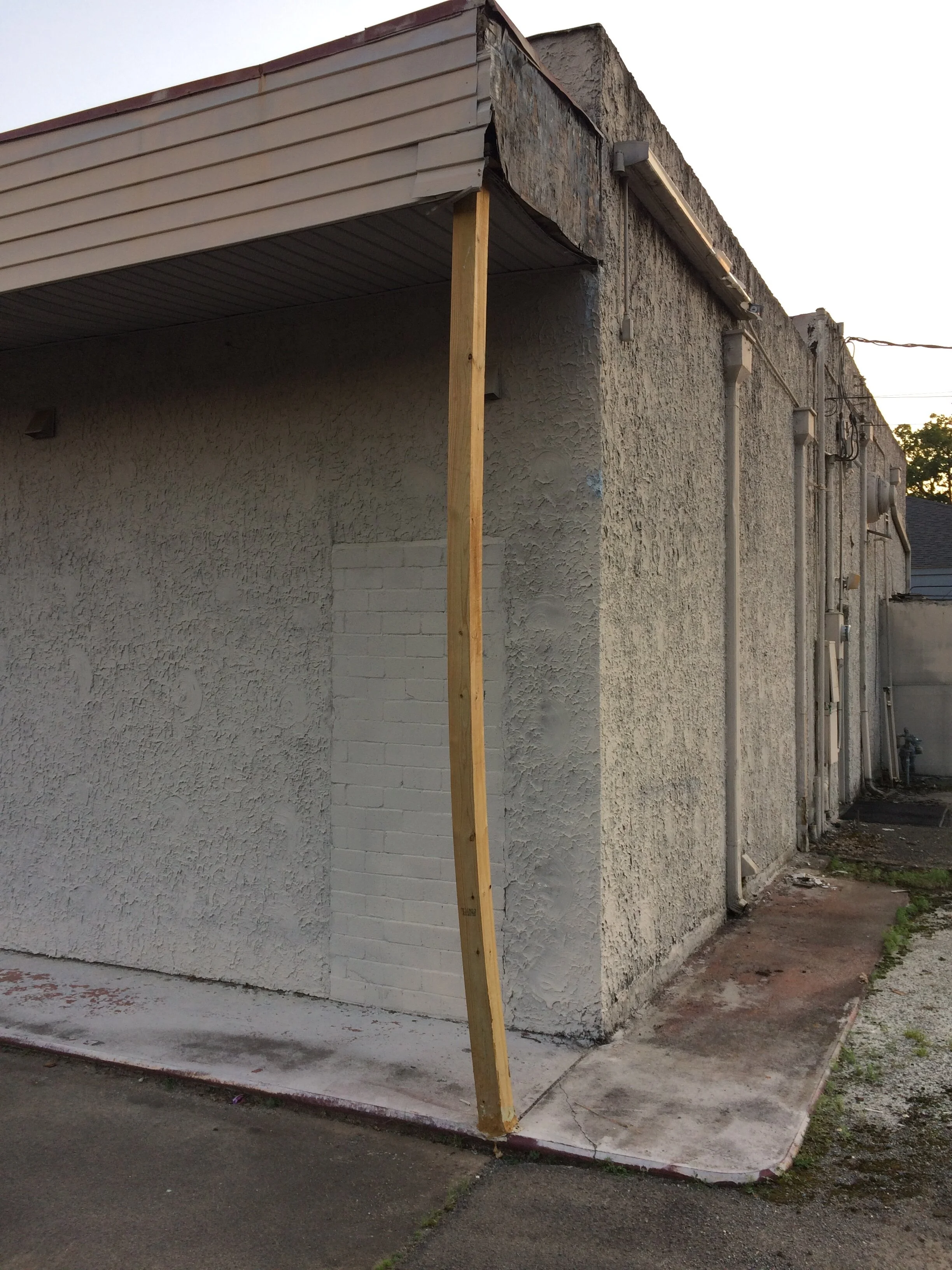
These are some of my favorite unintentional sculptures at the moment. Beyond being functional, they are visually striking in their angles and balance, and even create a sort of open-ended narrative. And as simple as they are, as mundane as the materials seem, there is also a sense of mastery, of knowing the particular physics of the place. You also get a visual reminder of gravity and weight, especially in the last one, where the post is buckling. They speak to time and the myth of stasis, the way all things tend toward decay and seek to lie flat on the ground, unless there is an intervention.

Small-Scale Works of Joel Shapiro

Several years ago, while visiting a friend in New Haven, we went to the Yale Art Gallery, and on one of the upper floors was a Joel Shapiro exhibit. It comprised some of his smaller works, many made of wood, some plaster (in fact, the exhibit was called Plaster, Paper, Wood, and Wire, though I did not recall this before I looked it up again). They reclined on the floor and clung to the wall, and were mostly monochromatic, painted in white or a single primary color. All in all, I remember being underwhelmed by them. In fact, my friend and I spent the next leg of our walk trying to put words to exactly what it was we didn't like about the work.

And yet it is now three years later, and those Shapiro sculptures, more than anything else we saw that day – more than the Voulkos plate, the Rauschenberg 'Interior', the Nevelson suspended sculpture, the Basquiat, even the Twombly – have stayed with me and floated back to the surface again and again. In particular was a simple inclined plane, built of plaster (according to the image sheet, though I remember it as plywood, painted opaque white). It sat on the floor, inviting you to come down to its level, to roll a ball down its surface or peer through channel cut in its base, while also calling to mind everything from early Egyptian architecture to Judd's wooden boxes to homemade access ramps.

In an interview with Shapiro a year before the Yale exhibit, when asked to look back over some of his early, small-scale works and trace a throughline to his newer work, Shapiro expresses a view of his own work that echoes what I felt upon first viewing it, though perhaps in reverse: "There are moments when the work looks good, and other times when you think, what am I doing?" When I first saw the work, I thought, What is he doing? My initial answer was, Not much, or perhaps, Not enough. And yet, as I have sat with it, I find myself agreeing with Shapiro: The work looks good. And not only does it look good, but it works on the viewer in some quiet, slow way.

From that same interview comes a great quote from Shapiro that perhaps helps to explain his work’s hold on me. When asked about his sculptures, he says, “They are playful and engaging. They interest me a great deal. At the end, as an artist, you are synthesising the stuff around you in a way that engages you. You don’t quite know what you’re doing. You only figure it out when you make the work.”

Below are images of Shapiro's small works in wood, beginning with some early pieces, from the late 1970s, and then moving through some works from the Yale show and the mid-2010s.

MoMA's Art of Assemblage, 1961

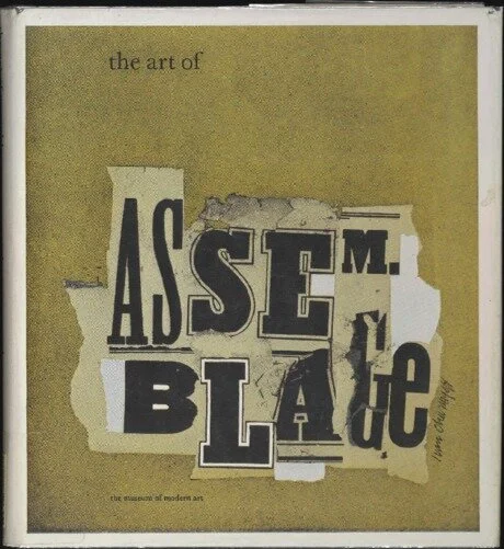
Along with immediately recognizable works by Cornell, Rauschenberg, and Duchamp, the 1961 exhibit at MoMA The Art of Assemblage included many works that I wouldn't necessarily classify as assemblage – straightforward collages by everyone from Picasso to Conrad Marca-Relli, torn-paper pieces by Bill Getman and Mimmo Rotella, and Burri's burlap canvasses. I am fortunate enough to have access to a hard copy of the exhibition catalog, and it makes explicit that the term assemblage "was adopted for this book and exhibition out of necessity, as a generic concept that would include all forms of composite art and modes of juxtaposition." It's a catchall which, in my opinion, renders the term so malleable as to be nearly meaningless – an assemblage is anything made from anything else.

(The exhibit curators acknowledge they are working from Dubuffet's use of the term, which distinguishes between collage and assemblage based not on the materials used but the time period in which the work was created: collage should be, according to Dubuffet, reserved for those works "made in the period 1910–1920 by the Dadaists, Picasso and Braque, etc." This still proves unsatisfactory, as several works by the Dadaists, Picasso and Braque, etc., are included in this collection, under the term assemblage.)

There were a number of artists included in the show whose work I didn’t know but which requires more research – George Herms and Robert Mallary to name two. But the heart of the show – and not only because a whopping 35 of his works are included – is Kurt Schwitters, who perhaps supplies a bridge across the collage-assemblage divide as I see it. Below are a couple of images of the exhibit and catalog, along with several of Schwitters’s works held by MoMA, though I can’t say for sure they were in the 1969 exhibit.